Learn how to create CSS Button RGB Animation
By Saheb Sutradhar - Updated On 26-04-2024
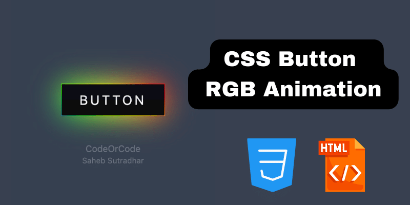
Want to add some pizzazz to your website's buttons? Look no further than CSS animation! With a few lines of code, you can create eye-catching RGB button animations that react to user interaction.
This tutorial will guide you through the process of creating a basic RGB animation that cycles through the color spectrum on hover.
Youtube Video URL : https://youtube.com/shorts/qyomqE7_YPM?si=YpgzfDr1qNvLjUtd
Setting Up the HTML
First, we'll need some basic HTML to create the button element. Here's a simple structure:
<a href="#"><span>Button</span></a>This code creates a button with the class "rgb-button". We'll use this class in our CSS to target the button for styling and animation.
Building the CSS Animation
Now comes the fun part: creating the animation! Here's the CSS code that will make the magic happen:
a{
    position: relative;
    width: 160px;
    height: 50px;
    line-height: 48px;
    background: #000;
    text-transform: uppercase;
    font-size: 20px;
    letter-spacing: 4px;
    text-decoration: none;
    -webkit-box-reflect: below 1px -webkit-
    linear-gradient(transparent, #0004);
}

a::before{
    content: '';
    position: absolute;
    top: 0;
    left: 0;
    width: 100%;
    height: 100%;
    background: linear-gradient(45deg, #fb0094, #00f, #0f0,
    #ff0, #f00, #fb0094, #00f, #0f0, #ff0, #f00);
    background-size: 400%;
    opacity: 0;
    filter: blur(20px);
    transition: 0.5s;
}
a::after{
    content: '';
    position: absolute;
    top: 0;
    left: 0;
    width: 100%;
    height: 100%;
    background: linear-gradient(45deg, #fb0094, #00f, #0f0,
    #ff0, #f00, #fb0094, #00f, #0f0, #ff0, #f00);
    background-size: 400%;
    opacity: 0;
    transition: 0.5s;
}

a:hover::before,
a:hover::after{
    opacity: 1;
    animation: animate 20s linear infinite;
}

@keyframes animate{
    0%{
        background-position: 0 0;
    }
    50%{
        background-position: 300% 0;
    }
    100%{
        background-position: 0 0;
    }
}

a span{
    position: absolute;
    display: block;
    top: 1px;
    left: 1px;
    right: 1px;
    bottom: 1px;
    text-align: center;
    background: #0c0c0c;
    color: rgba(255, 255, 255, 0.2);
    transition: 0.5s;
    z-index: 1;
}
With these steps, you can easily implement RGB button animations on your website and create an engaging user interface that stands out from the crowd.
Trending Posts

What Are the Hooks in React...
Create Input Floating Label in CSS and HTML...
CSS Card Hover Effects: Make Your Website Stand Ou...
Create a Rotate Image Gallery with HTML and CSS...
CSS Hover Effect | Web Development...

How to create MongoDB Free cloud Database - Atlas ...
Learn how to create CSS Button RGB Animation...

Create Responsive Sidebar with React JS and tailwi...
Build a JavaScript Carousel Slider With Example...
How to Disable the Submit Button in Formik...