CSS Card Hover Effects: Make Your Website Stand Out
By Saheb Sutradhar - Updated On 03-05-2024
In the world of website design, even small details can make a big difference. One of these small but impactful details is the hover effect. When you hover over something on a webpage and it changes or moves, that's a hover effect. These effects can make your website more interesting and fun to use.
Today, we're going to learn how to create cool hover effects for cards using CSS. Cards are those little boxes you often see on websites showing things like articles, products, or profiles. By adding hover effects to these cards, we can make them more attractive and engaging.
And here's the HTML code:
<!DOCTYPE html>
<html lang="en">
<head>
    <meta charset="UTF-8">
    <meta http-equiv="X-UA-Compatible" content="IE=edge">
    <meta name="viewport" content="width=device-width, initial-scale=1.0">
    <title>CSS Card Hover Effects</title>
    <link rel="stylesheet" href="main.css">
</head>
<body>

    <div class="wrapper">
        <div class="card">
            <img src="../images/1.png" alt="image">
            <div class="info">
                <h1>CODEORCODE</h1>
                <p>Lorem Ipsum has been the industry's
                    standard dummy text ever since the 1500s, when an unknown
                    printer took a galley of type and scrambled it to make a
                    type specimen book.</p>
                <a href="#" class="btn">Read More</a>
            </div>
        </div>
    </div>

</body>
</html>
And here's the CSS code:
* {
    margin: 0px;
    padding: 0px;
    font-family: Arial, Helvetica, sans-serif;
}

body {
    width: 100%;
    height: 100vh;
    display: flex;
    justify-content: center;
    align-items: center;
    background: rgb(49, 5, 128);
    background: linear-gradient(90deg, rgba(49, 5, 128, 1) 0%, rgba(70, 252, 203, 1) 100%);
}

.card {
    width: 260px;
    height: 350px;
    position: relative;
    display: flex;
    align-items: flex-end;
    box-sizing: border-box;
    transition: 0.5s ease-in-out;
    padding: 20px;
    border-radius: 10px;
    overflow: hidden;
}

.card img {
    width: 100%;
    height: 100%;
    object-fit: cover;
    position: absolute;
    top: 0;
    left: 0;
}

.card:hover {
    transform: translateY(20px);
}

.card::before {
    content: '';
    position: absolute;
    top: 0;
    left: 0;
    display: block;
    width: 100%;
    height: 100%;
    background: rgb(0,0,0);
    background: linear-gradient(17deg, rgba(0,0,0,1) 0%, rgba(0,0,0,1) 100%);
    opacity: 0;
    transition: 0.5s all;
    z-index: 2;
}

.card:hover::before {
    opacity: 0.5;
}

.card .info {
    position: relative;
    z-index: 3;
    color: rgb(222, 222, 222);
    opacity: 0;
    transition: 0.5s all;
    transform: translateY(30px);
}

.card:hover .info {
    opacity: 1;
    transform: translateY(0px);
}

.card .info p {
    letter-spacing: 1px;
    font-size: 12px;
    margin-top: 8px;
    margin-bottom: 20px;
}

.card .info .btn {
    padding: 5px 10px;
    color: black;
    background: rgb(255, 255, 255);
    font-size: 13px;
    font-weight: bold;
    cursor: pointer;
    transition: 0.4s ease-in-out;
    text-decoration: none;
    border-radius: 4px;
}
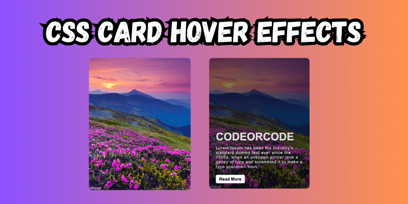
In this code, we've created a cool-looking card with some neat hover effects. Here's what's happening:
-
Card Setup: The card contains an image and some information inside a box.
-
Styling with CSS: We've used CSS to make the card look nice with rounded corners and a background color.
-
Hover Effects: When you hover over the card, it moves a little and darkens. Also, the information inside the card fades in smoothly.
-
Button Style: The "Read More" button changes color smoothly when you hover over it.
By adding these hover effects, your website can become more lively and attractive to visitors. Try playing around with different effects and colors to make your cards even cooler!
Trending Posts

What Are the Hooks in React...

Create Input Floating Label in CSS and HTML...
CSS Card Hover Effects: Make Your Website Stand Ou...
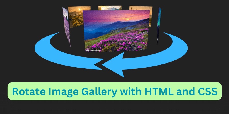
Create a Rotate Image Gallery with HTML and CSS...
CSS Hover Effect | Web Development...

How to create MongoDB Free cloud Database - Atlas ...
Learn how to create CSS Button RGB Animation...

Create Responsive Sidebar with React JS and tailwi...
Build a JavaScript Carousel Slider With Example...
How to Disable the Submit Button in Formik...