Create a Rotate Image Gallery with HTML and CSS
By Saheb Sutradhar - Updated On 01-05-2024
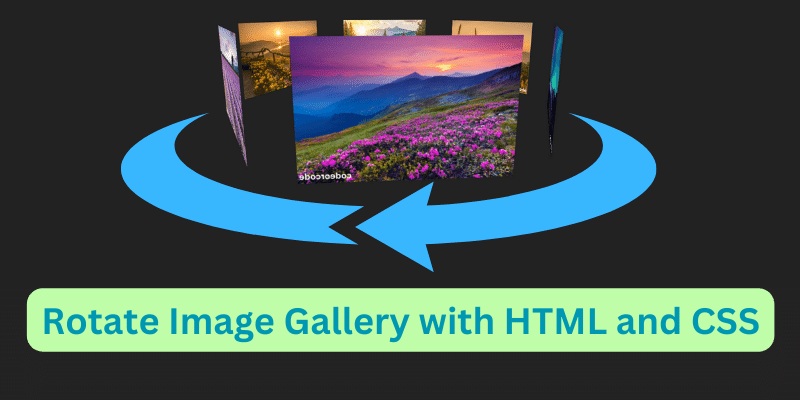
In the realm of web design, showcasing images in an engaging and dynamic manner is paramount. One captivating method to achieve this is through a rotating image gallery. By incorporating HTML and CSS, we can construct an impressive rotating gallery that grabs the viewer's attention. Let's dive into how to implement this technique.
HTML Structure
Firstly, let's lay down the HTML structure. We'll use a simple div container to hold our images. Each img tag within this container will represent an image in our gallery. Here's the basic structure:
<!DOCTYPE html>
<html lang="en">
    <head>
        <meta charset="UTF-8">
        <meta http-equiv="X-UA-Compatible" content="IE=edge">
        <meta name="viewport" content="width=device-width, initial-scale=1.0">
        <title>Document</title>
        <link rel="stylesheet" href="main.css">
    </head>
    <body>
        <div class="rotate_gallery">
            <img src="./images/1.png" alt="codeorcode-image">
            <img src="./images/2.png" alt="codeorcode-image">
            <img src="./images/3.png" alt="codeorcode-image">
            <img src="./images/4.png" alt="codeorcode-image">
            <img src="./images/5.png" alt="codeorcode-image">
            <img src="./images/6.png" alt="codeorcode-image">

        </div>
    </body>
</html>
CSS Styling
Next, let's style our rotating gallery using CSS. We'll define the layout, animation, and positioning of our images within the gallery container. Below is the CSS code:
* {
  padding: 0px;
  margin: 0px;
}
body {
  min-height: 100vh;
  display: flex;
  align-items: center;
  justify-content: center;
  background: #222222;
  overflow: hidden;
}
.rotate_gallery {
  --size: 180px;
  display: grid;
  transform-style: preserve-3d;
  animation: rotateGallery 25s infinite linear;
  position: relative;
}
@keyframes rotateGallery {
  0% {
    transform: perspective(450px) rotateX(-100deg) rotate(0deg);
  }
  to {
    transform: perspective(450px) rotateX(-100deg) rotate(-360deg);
  }
}

.rotate_gallery > img:nth-child(1) {
  --_a: 300deg;
}
.rotate_gallery > img:nth-child(2) {
  --_a: 240deg;
}
.rotate_gallery > img:nth-child(3) {
  --_a: 180deg;
}
.rotate_gallery > img:nth-child(4) {
  --_a: 120deg;
}
.rotate_gallery > img:nth-child(5) {
  --_a: 60deg;
}
.rotate_gallery > img:nth-child(6) {
  --_a: 0deg;
}
.rotate_gallery > img {
    grid-area: 1/1;
    width: var(--size);
    aspect-ratio: 1;
    object-fit: contain;
    border-radius: 4px 4px 0 0;
    transform: rotate(var(--_a)) translateY(120%) rotateX(90deg);
  }
Explanation of CSS
rotateGallery: This keyframe animation rotates the gallery container along the X-axis, creating a spinning effect..rotate_gallery > img:nth-child(n): This selector targets each individual image within the gallery and sets their initial rotation angle.transform: rotate(var(--_a)) translateY(120%) rotateX(90deg);: This line positions each image within the gallery and sets its rotation angle.
Conclusion
With this HTML and CSS code, you can create a visually stunning rotating image gallery that adds an extra layer of dynamism to your website. Feel free to customize the size, rotation speed, and styling to suit your design preferences. Happy coding.
Trending Posts

What Are the Hooks in React...

Create Input Floating Label in CSS and HTML...

CSS Card Hover Effects: Make Your Website Stand Ou...
Create a Rotate Image Gallery with HTML and CSS...
CSS Hover Effect | Web Development...

How to create MongoDB Free cloud Database - Atlas ...
Learn how to create CSS Button RGB Animation...

Create Responsive Sidebar with React JS and tailwi...
Build a JavaScript Carousel Slider With Example...
How to Disable the Submit Button in Formik...