Create Input Floating Label in CSS and HTML
By Saheb Sutradhar - Updated On 08-05-2024

Floating labels are a popular design technique that enhances the user experience in web forms. They provide a clear label for the input field, even when the field is empty. This makes it easier for users to understand what information is needed, especially on forms with minimal labels.
In this blog post, we'll explore how to create floating labels using pure HTML and CSS.
Creating the Floating Label Effect
HTML Structure:
We'll use a simple HTML structure with an <input> element and a <span> element. The key here is to position the label element after the input field.
<!DOCTYPE html>
<html lang="en">
    <head>
        <meta charset="UTF-8">
        <meta http-equiv="X-UA-Compatible" content="IE=edge">
        <meta name="viewport" content="width=device-width, initial-scale=1.0">
        <title>Codelearningpoint | @codeorcode</title>
        <link rel="stylesheet" href="main.css">
    </head>
    <body>

        <div class="inputBox">
            <input type="text" required>
            <span>First Name</span>
        </div>

        <div class="inputBox">
            <input type="text" required>
            <span>Last Name</span>
        </div>

    </body>
</html>
CSS Styling:
Now, we'll use CSS to style the input field and label to achieve the floating effect. We'll target two scenarios:
/* Reset default margin, padding, and box-sizing for all elements */
* {
    margin: 0;
    padding: 0;
    box-sizing: border-box;
    font-family: 'Poppins', sans-serif; /* Use 'Poppins' font family or fallback to generic sans-serif */
}

/* Style the body element */
body {
    display: flex; /* Use flexbox layout */
    align-items: center;
    justify-content: center;
    flex-direction: column; /* Arrange child elements in a column */
    gap: 30px; /* Set gap between flex items */
    background-color: rgb(8, 59, 115); /* Dark blue background color */
    min-height: 100vh; /* Ensure body fills at least the viewport height */
}

/* Style for input container */
.inputBox {
    position: relative; /* Position relative for absolute positioning of label */
    width: 240px; /* Set width of input box */
}

/* Style for input fields */
.inputBox input {
    width: 100%; /* Fill entire width of container */
    padding: 20px; /* Add padding for spacing */
    border: 1px solid gray; /* Add border */
    background-color: rgb(8, 59, 115); /* Match background color */
    border-radius: 5px; /* Add border radius */
    outline: none; /* Remove default outline */
    color: white; /* Set text color */
    font-size: 15px; /* Set font size */
}

/* Style for floating labels */
.inputBox span {
    position: absolute; /* Position absolutely */
    left: 0; /* Align to left */
    padding: 20px; /* Add padding */
    pointer-events: none; /* Don't capture mouse events */
    font-size: 15px; /* Set font size */
    text-transform: uppercase; /* Transform text to uppercase */
    color: rgb(121, 122, 123); /* Set color */
    transition: 0.4s; /* Add transition for smooth effect */
}

/* Styling for focused and valid input fields */
.inputBox input:focus + span,
.inputBox input:valid + span {
    color: cyan; /* Change color */
    font-size: 10px; /* Change font size */
    padding: 0 10px; /* Adjust padding */
    background-color: rgb(8, 59, 115); /* Match background color */
    border-left: 1px solid cyan; /* Add left border */
    border-right: 1px solid cyan; /* Add right border */
    letter-spacing: 3px; /* Adjust letter spacing */
    transform: translateY(-5px) translateX(10px); /* Apply transformation */
}

/* Additional styling for specific input boxes */
.inputBox:nth-child(2) input:focus + span,
.inputBox:nth-child(2) input:valid + span {
    background-color: cyan; /* Change background color */
    color: rgb(0, 0, 0); /* Change color */
    border-radius: 2px; /* Add border radius */
    padding: 1px 10px; /* Adjust padding */
}

/* Styling for valid and focused input fields */
.inputBox input:valid,
.inputBox input:focus {
    border: 1px solid cyan; /* Change border color */
}
Incorporating input floating labels into your web forms can significantly enhance the user experience, making interactions more intuitive and visually appealing. By leveraging the power of CSS, you can create sleek and modern forms that delight users and elevate your website's design. So why wait? Implement input floating labels today and take your web forms to the next level.
Trending Posts

What Are the Hooks in React...
Create Input Floating Label in CSS and HTML...

CSS Card Hover Effects: Make Your Website Stand Ou...
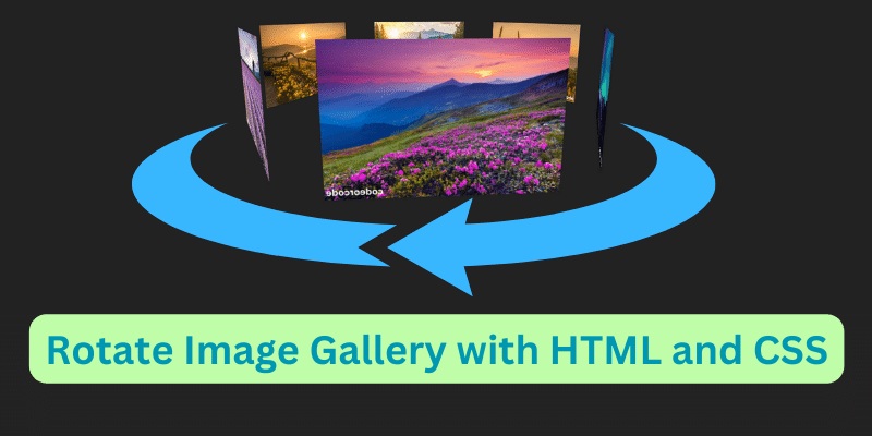
Create a Rotate Image Gallery with HTML and CSS...
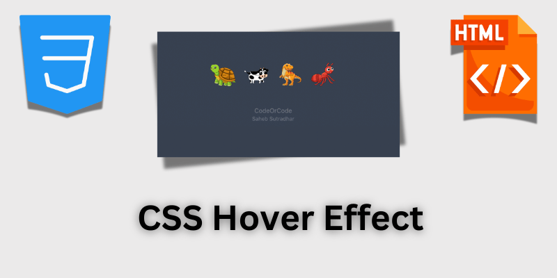
CSS Hover Effect | Web Development...

How to create MongoDB Free cloud Database - Atlas ...
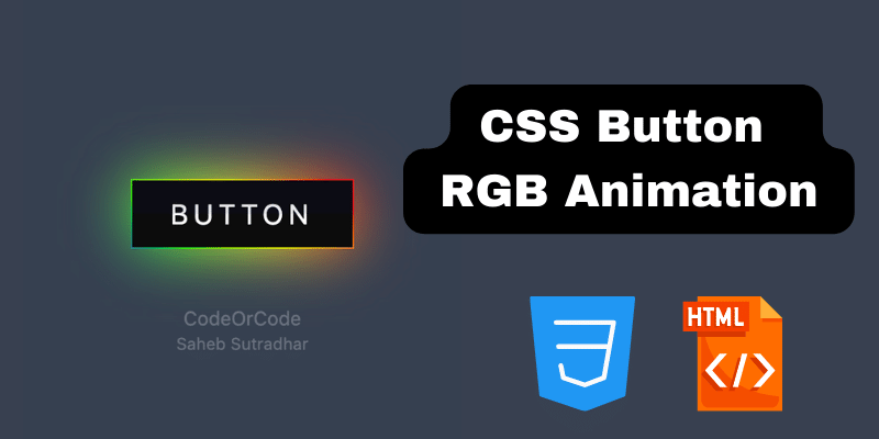
Learn how to create CSS Button RGB Animation...

Create Responsive Sidebar with React JS and tailwi...
Build a JavaScript Carousel Slider With Example...
How to Disable the Submit Button in Formik...